We built from discovery
We studied the company’s market, audiences, history, services, personality, and daily communication needs before moving into visual concepts.
Energy & land-services branding
Lowry Land serves public and private energy companies, operators, mineral and investment organizations, and individual professionals through complex title, acquisition, due-diligence, regulatory, records, mapping, and related land services. Click Media led a comprehensive brand study and identity-development process designed to express that experience with greater distinction.
Click Media scope

The business
The company’s work is detailed, consequential, and rooted in continuity. Its identity needed to communicate established expertise and professional authority while remaining recognizable across everyday operational materials.
The engagement considered positioning, audience, competitive context, industry language, visual territory, color psychology, typography, and the practical places where the brand would appear.
The challenge
The assignment was to create a modern identity relevant to energy and land services without relying on predictable oil-and-gas symbols, then turn it into a system the company could use consistently.
The approach
We studied the company’s market, audiences, history, services, personality, and daily communication needs before moving into visual concepts.
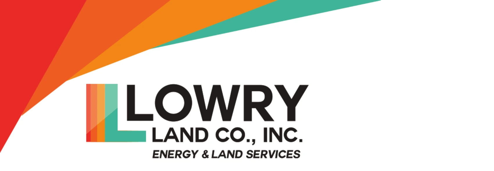
Red and orange express energy, momentum, and confidence; gold suggests land, opportunity, and lasting value; and teal brings trust, stability, and professional credibility.
We layered the colors into a distinctive L suggesting land strata, boundaries, mapping, and forward movement without becoming literal.
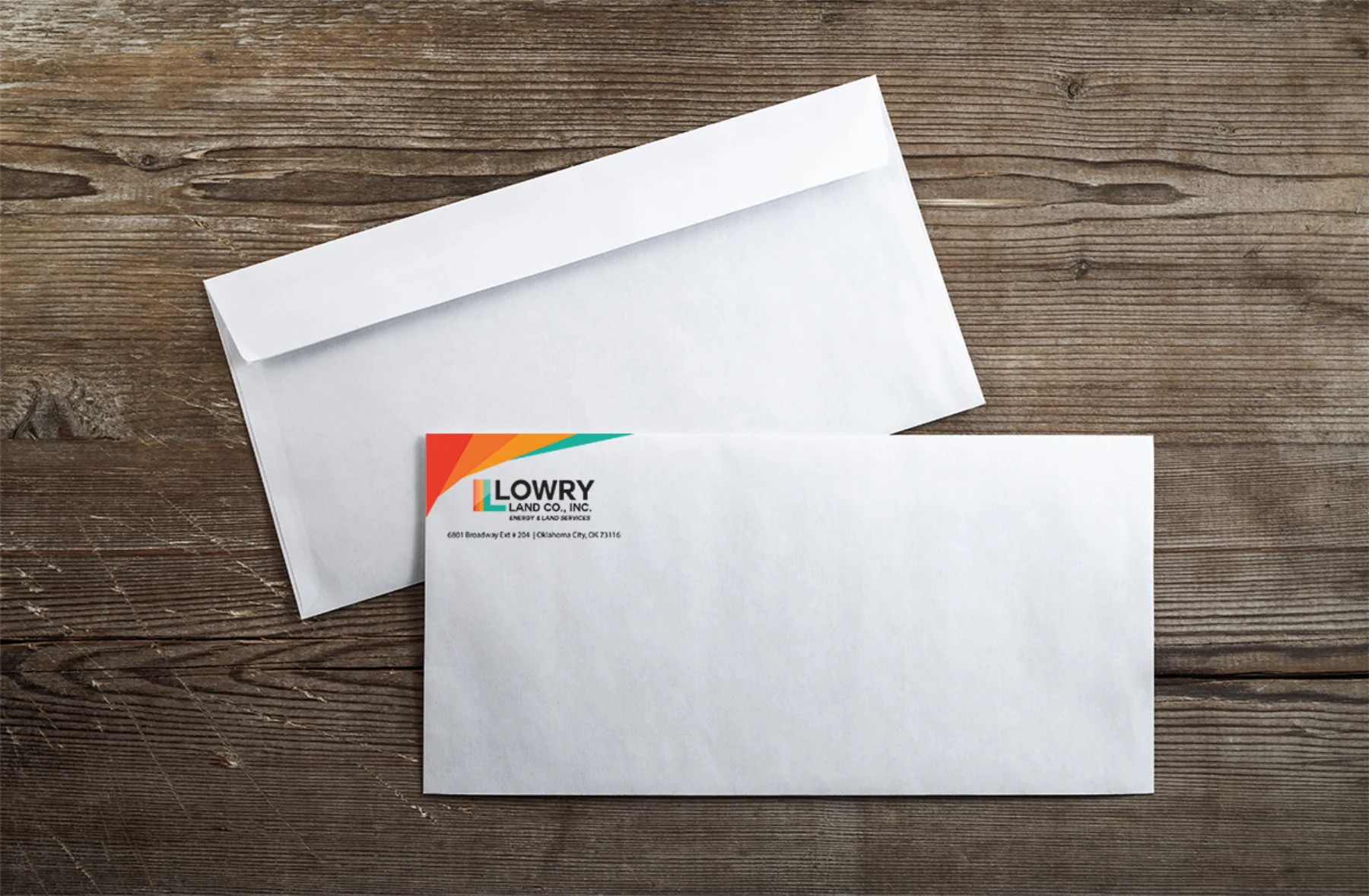
We extended the system across business cards, envelopes, postcards, labels, mailing materials, and print-production specifications.
What the work made possible
The resulting system balances the energy of the multicolor mark with strong black typography, creating an identity that feels confident, established, and usable.
Because the strategy was carried through real applications, the brand works as more than a logo: it creates continuity across the materials Lowry Land uses to conduct business every day.
Attribution note: Lowry Land’s website is linked only for current company and service context. Click Media did not design or develop that website; this case study covers the brand strategy, identity, collateral, and print work shown here.
Have a project in mind?